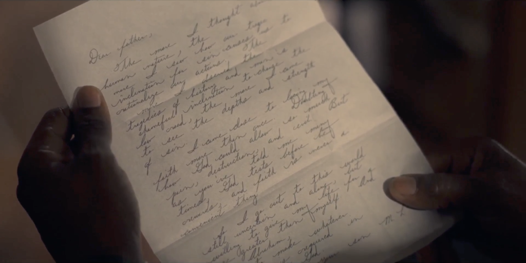
An excellent example showcasing the usage of historic handwriting fonts can be found in National Geographic’s TV Series Geniuses MLK/X episode 1 “Graduation” directed by Channing Godfrey Peoples.

While the printed letter only fills the screen for a few seconds, the handwriting font gives this content an adequate form. In this case, especially because the font is based on handwriting samples from King’s time at Crozer Theological Seminary and Boston University. So, the time referenced in the scene matches the creation time of the handwritten sources used to create the font. Congrats!
Usually, when handwritten documents are shown in films, one can’t really read the text. Often, it is just something that looks like handwriting and pays tribute to the director’s or viewers aesthetic expectations rather than what is historically reasonable. In National Geographic Genuses MLK/X, the creative team made a careful choice with respect to the aesthetic of the historical subject matter.


Here the scene in it’s entirety:
Critique
Why I am giving this example a A- and not an A+? — Although the work is excellent, I found two reasons why I think this is not an A+ usage case. And one of them even contributed to improving the Martin Luther King font!

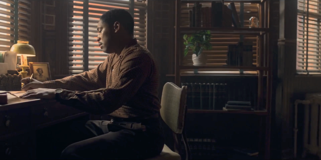
The first is this view on MLK’s desk where he is writing the letter. I was looking to see another possible use of the font. I could not for sure see a relation of the handwriting shown here to MLK, but instead this Headline caught my eye.
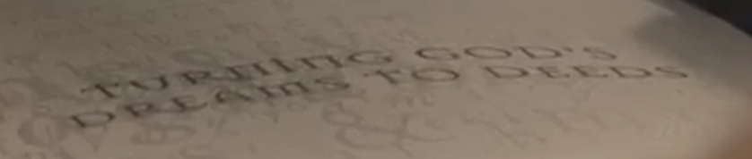
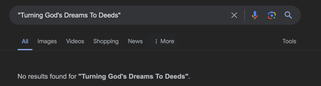
At first I was curious to see what this “TUNRING GOD’S DREAMS TO DEEDS” is about. But a quick search came up with nothing.
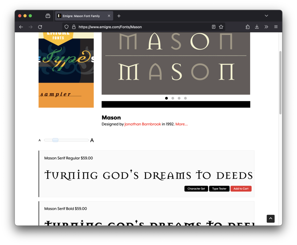
Naturally this made me curious. Since the production went so far to use the Martin Luther King handwriting font to reproduce his handwriting, what is behind this? The letter forms are very special — Weirdly they reminded me of something 90s. And indeed when I consulted my specimen books, similar styles can be found in that time-frame, but no exact hit. The AI font search tools on the internet came up with nothing, so I posted the screen grab on reddit and a few minutes later user elzadra1 had a first hint: Emigre’s Mason.
And this tip was spot on. Here you can see the font on Emigre’s website.
In its design, Barnbrook was influenced by nineteenth-century Russian letter forms, Greek architecture, and Renaissance Bibles. The font also displays many references to popular culture, politics, and typographic history. Mason’s postmodern attitude is undeniable and […] emerged during the explosion of digital typefaces in the early 1990s, both products of the technological and cultural influences of the time.
Barnbrook originally called this typeface Manson (after American serial killer Charles Manson) “to express extreme opposite emotions of love and hate, beauty and ugliness.” After releasing the font, Emigre came under heavy scrutiny for glorifying a murderer, and decided to change the name to Mason, as the letter forms also evoke stonecutters’ work, Freemasons’ symbology, and pagan iconography.
In 2011 Mason Sans (a version of Mason) was one of 23 digital typefaces included in the permanent architecture and design collection of the Museum of Modern Art in New York.
I love Emigre, as a student I bought some of their publications, their work is challenging and even today looking at it, it shows that type can be a vehicle of something interesting, more than “just nice” to look at. My concern with this choice is, why lay a font that references Charles Manson and Freemasons, designed in 1992 onto a table that should render MLKJs study in the 50s? On the other hand the reference to the sampling of Russian letterforms, Greek architecture and Renaissance Bibles does echo the mindset of a student. However it seems to me more of a strong personal choice. A choice that granted me this joyful dive into 90s font design. Thanks.
Second Critique: The use of OpenType Features
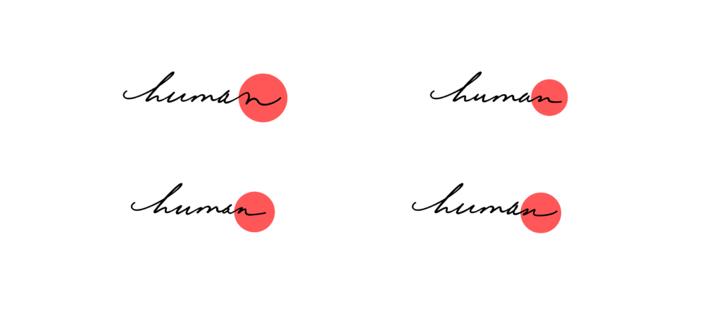
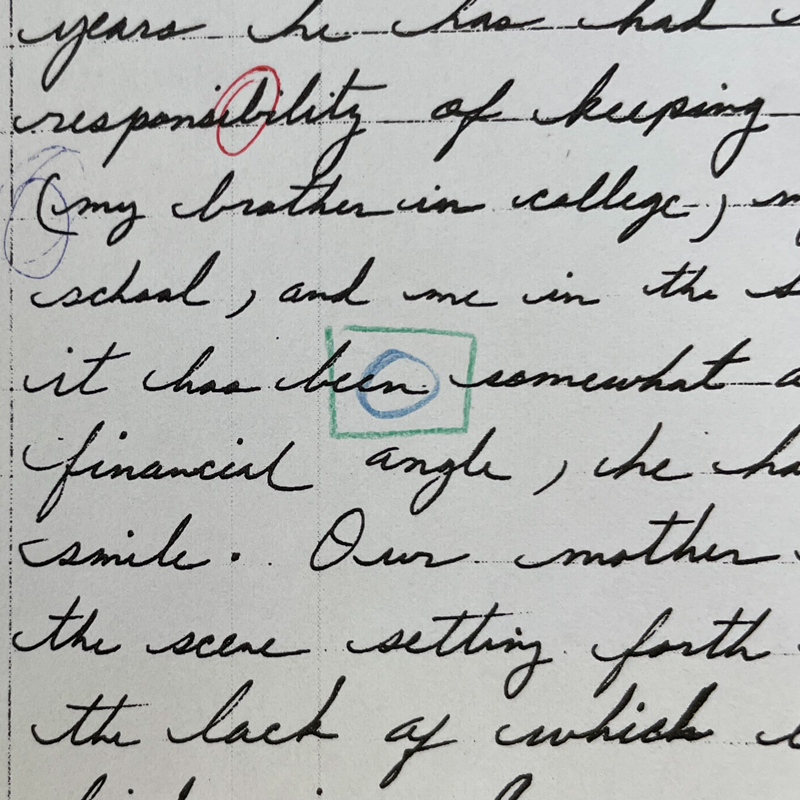
One leading quality of handwriting fonts from handwriting.digital is variety in forms. Fonts hold different versions of each lowercase letter; some fonts (like this font) even have particular variations for initial and final lowercase letters. Because letter forms at the beginning or end of the word are often written with more “flow” and create a different form – these features bring a font significantly closer to the look of the original handwriting. When we look at the printed letter, we see certain letters sticking out in the overall composition and being repeated. For example, in the final form of the letter “n.”
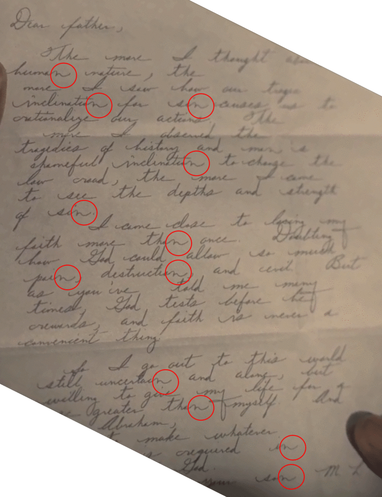
The font until now had multiple variations for the letter n but only one version to be used at the end of a word.
This can be easily fixed by manually adapting to one of the other n variations used for the middle of a word; they are still n’s, just not as expressive as the end forms.
This pointed me to a possible improvement of the font. There are many words in the English language that end with an n. So, with update #41, I am introducing three new variations of the final n. From now on, Anyone using the font will get a result with more variety, closer to the original manuscripts. You can read about the update in detail →here.
Here you can see the added n-variations with the original manuscript sources:
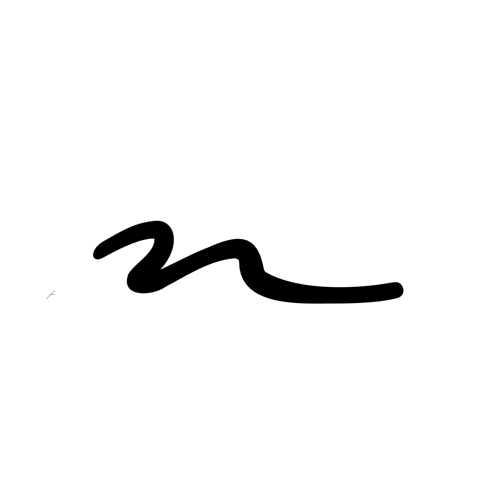
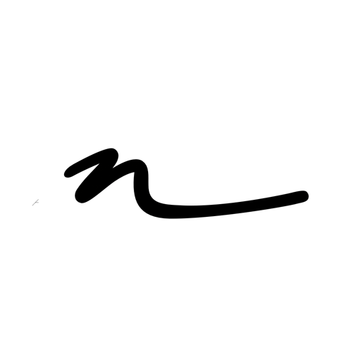
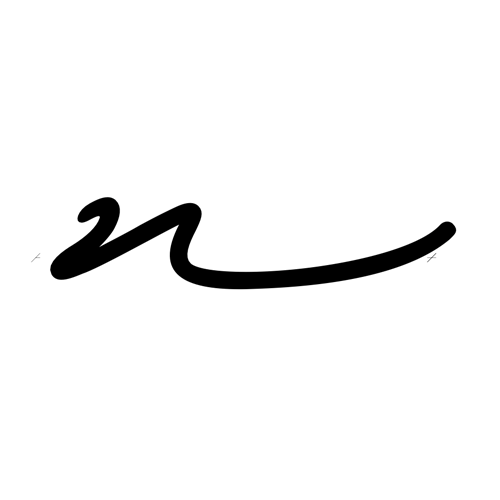


All samples are from “An Autobiography of Religious Development.”
Try the handwriting font yourself
Are you curious to try out the Martin Luther King, Jr. handwriting font yourself? Private, educational and non-commercial use is free.
All handwriting fonts come with “Sample Documents” for various software such as Word, PowerPoint, Pages, OpenOffice, and InDesign. These documents are designed to help you get started quickly.
Feel free to comment, give feedback or ask a question below ↓. Thanks!
Leave a Reply
You must be logged in to post a comment.