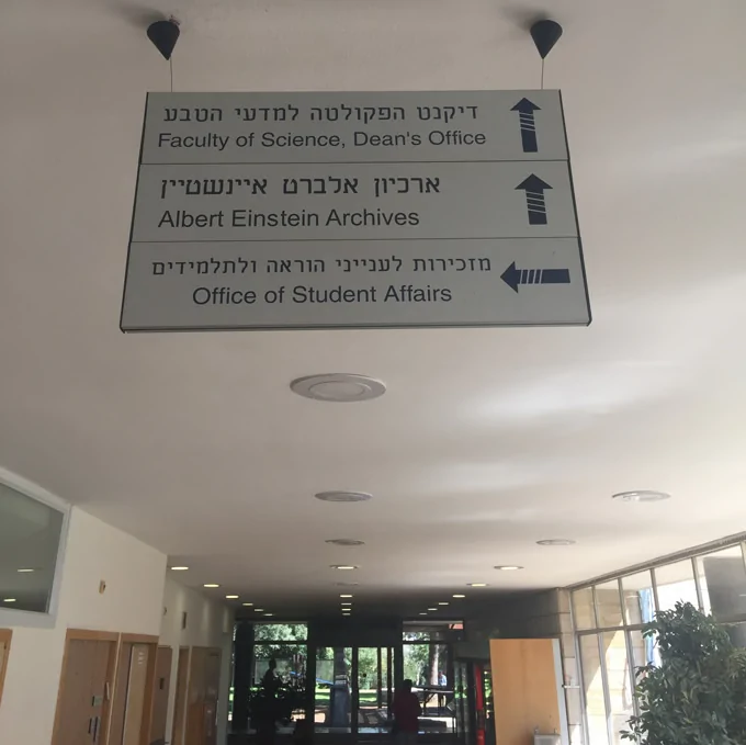
I wanted to share with you that I finally visited the Albert Einstein Archive in Jerusalem, where I had the chance to study original letters from Albert Einstein and Sigmund Freud side by side!
Since 2010, when I first started developing the Albert Einstein font, I worked with the Albert Einstein Archive in Jerusalem over the internet. In the last days of September 2017, I had the chance to visit the Archive for the first time and actually see the manuscripts I had studied intensely on computer screens firsthand.
The measures to securely archive the manuscripts were surprisingly profound. I understood that better when, a few weeks after my visit, one of Einstein’s notes was auctioned for $1.6 million.
Dr. Roni Grosz, director of the archive, welcomed me very warmly, and we talked for a long time about Freud’s handwriting, particularly discussing the German letter “ß” and its uppercase counterpart, as well as the challenges of preserving manuscripts.
Regarding the relationship between Einstein and Freud, Chaya Becker, the archivist at the Einstein Archive, referred me to some books found in Einstein’s library, which were apparently gifts from Freud to Einstein.

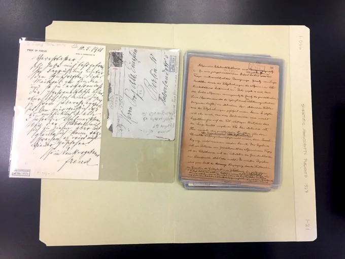
The archive contains a thick folder regarding the relationship between the two:
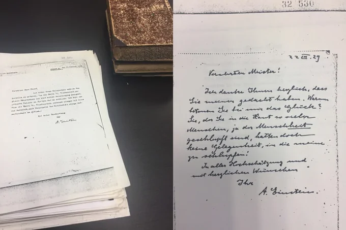
In the letter above from Einstein, one finds a friendly, respectful, and joking tone as he plays with the idea of being analyzed by Freud in 1929.
My personal highlight was examining Freud’s and Einstein’s handwriting side by side. Here is a letter from Freud to Einstein, the addressed envelope, and a scientific paper by Einstein:
Einstein’s paper on the right became a visual reference for me during the font development. While working on the font, I constantly tested it against this page. You can find this comparison in the documentation I created for the font.
Until then I had only worked with high-resolution scans, and it is quite different to see originals firsthand. At the time it led me to the conclusion that the scanning process “somehow” changes the perception of a document.
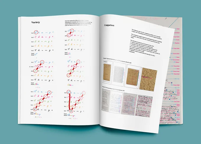
If you have not yet looked at the documentation, I recommend that you do so. It contains a concise but thoroughly detailed overview of my creation process and the inner workings of the font.
Leave a Reply
You must be logged in to post a comment.