
Bring History to Life with Our Authentic Martin Luther Handwriting Font.
Experience the influential words of Martin Luther as they appeared in his original handwriting. Meticulously crafted from 16th-century manuscripts, this font captures the reformer’s calligraphic style. Various features preserve the characteristics of handwritten text, so you’ll feel as if you’re holding history in your hands. Add historical authenticity to your creative projects, whether writing a history paper or exploring theology. With this thoroughly documented font, you can immerse yourself in the Reformation period of the 16th century. It is suitable for both personal and academic use.
Created with the support of 491 Backers from 32 countries on ![]() 1
1
Features of the Font
Getting 
This font is part of the paid-library. Interested in trying it yourself? Join the Handwriting Font Library for instant access to our entire collection, for only €2/month.
What does Martin Luther’s handwriting actually look like?
The font comes with a PDF documentation, which includes an extensive chapter by Prof. Bubenheimer describing in detail the characteristics of Luther’s handwriting from a paleographers point of view. Here you find shortened examples to give you an introduction.
Gothic vs. Humanist cursive
In his German and Latin writings Luther used two distinctive scripts, namely a German and Latin one. His German texts are written predominantly in gothic cursive, his Latin texts predominantly in humanist cursive.

We are used to thinking of ‘o’ as a round letter, but in Luther’s gothic script it can be angular.
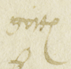
In line 13 of Luther’s draft the ‘o’ in the word ‘gott(es) is in the form of an upside-down triangle, in which the pen stroke is repeatedly fractured. Sometimes also the loops in b and l are triangular in shape (‘endlich bleybe’, line 11). These letter forms may reflect a partial influence of the so-called Bastarda, a more calligraphic version of the gothic cursive.

Another typical example of fracture is Luther’s writing of minuscule ‘g’ (‘gottes’, line 2)
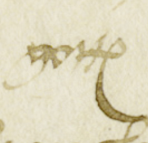
He begins with an oblique downstroke, continues with a sharp angle and an upstroke, and then makes a further sharp angle into a downward loop, which curls up and eventually runs out along the ‘roof’ of the ‘g’. In the minuscule ‘d’ (‘vnnd’, line 1), fracture can also be seen in the lower part of the letter.

Image Source
Luther’s draft of a speech
intended to be given before
Emperor Charles V.
Landesarchiv Thüringen,
Hauptstaatsarchiv Weimar:
Ernestinisches Gesamtarchiv,
Reg. E 81, fol. 1r.

In Luther’s draft speech, individual letters occur which are clearly from his Latin cursive script.
It is particularly with majuscules (capital letters) that, even in his German texts, Luther prefers the clear, humanist forms – in this text the letters ‘A’, ‘M’, ‘H’, and ‘V’ (lines 1, 3, 9, 12, and 18), which are often easier to write than the loopier, squigglier gothic forms.

The “&“
For ‘et’ Luther employs the conventional humanist cursive sign corresponding to our ‘&’, with a peculiarity which was not, in fact, unique among those around him, in that he generally writes the grapheme in two parts, with an alpha shape underneath and a small circle (rather than a loop) on top, although sometimes both parts are written in a single stroke.

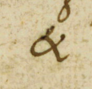
Image Source
Luther’s letter to Emperor Charles V, Friedberg, 28 April 1521, first page.
Lutherhaus Wittenberg: s 166/1387, fol. 1r.
→ See “comparing handwriting and font“ below for additional details.
Quality Check — ✔︎ Comparing handwriting and font.
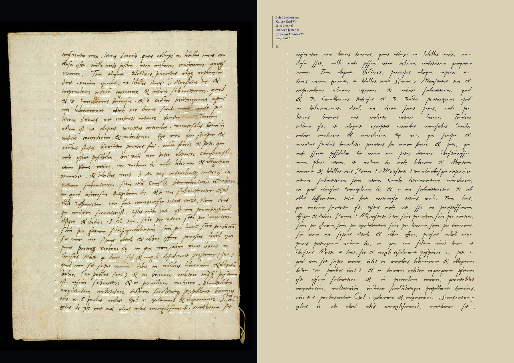
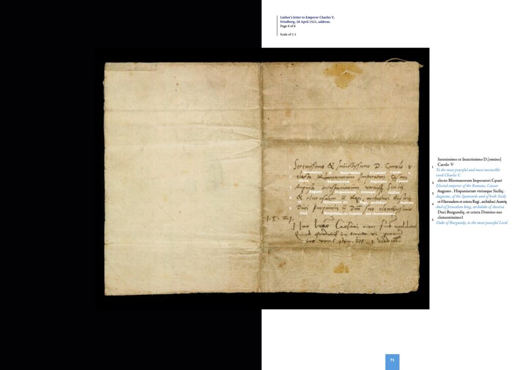
Creating an authentic handwriting font requires a careful and thorough process of comparing the digital version to the original to ensure accuracy and capture the author’s unique style. Here you see the original manuscript compared with the same text set in the font. These comparison documents are feedback tools in the creation process.
The development is not always a straightforward process. Often, there is a going back and forth to make improvements. The original analog version serves as a benchmark to measure progress.
Resources on Martin Luther’s Handwriting
1. View Martin Luther’s handwriting in Augmented Reality. (experimental)
Project an original size reproduction of Martin Luther’s draft of a speech at home through the magic of augmented reality. Use the green buttons to view a transcript and translation of the text.
The best experience is with a modern iPhone or iPad.
We are working on a functional Android version.
2. A Book the font and Luther’s handwriting:
What does Martin Luther’s handwriting look like? And how can we use it today? (Dual language edition: All texts are in English and German)
This book is an documentation of the creation process and extensive introduction to Luther’s handwriting.
Buy the book as → Softcover or → Hardcover Edition on Amazon. As a library member you can download a PDF file in the → download section.
International Orders
Hardcover (ISBN 979-8345107171):
Amazon US https://www.amazon.com/dp/B0DPMXTMTZ
Amazon UK https://www.amazon.co.uk/dp/B0DPMXTMTZ Amazon DE https://www.amazon.de/dp/B0DPMXTMTZ
Amazon NL https://www.amazon.nl/dp/B0DPMXTMTZ
Amazon PL https://www.amazon.pl/dp/B0DPMXTMTZ
Amazon SE https://www.amazon.se/dp/B0DPMXTMTZ
Amazon CA https://www.amazon.ca/dp/B0DPMXTMTZ
Amazon FR https://www.amazon.fr/dp/B0DPMXTMTZ
Amazon ES https://www.amazon.es/dp/B0DPMXTMTZ
Amazon IT https://www.amazon.it/dp/B0DPMXTMTZ
Softcover:
Amazon US https://www.amazon.com/dp/B0DQWB53YJ
Amazon UK https://www.amazon.co.uk/dp/B0DQWB53YJ
Amazon DE https://www.amazon.de/dp/B0DQWB53YJ
Amazon NL https://www.amazon.nl/dp/B0DQWB53YJ
Amazon PL https://www.amazon.pl/dp/B0DQWB53YJ
Amazon SE https://www.amazon.se/dp/B0DQWB53YJ
Amazon CA https://www.amazon.ca/dp/B0DQWB53YJ
Amazon FR https://www.amazon.fr/dp/B0DQWB53YJ
Amazon ES https://www.amazon.es/dp/B0DQWB53YJ
Amazon IT https://www.amazon.it/dp/B0DQWB53YJ
Amazon AU https://www.amazon.com.au/dp/B0DQWB53YJ Amazon JP https://www.amazon.co.jp/dp/B0DQWB53YJ (not working at the moment)
Sample Pages
The book explains in detail how the font was created, outlining the specific process and techniques used to replicate Martin Luther’s handwriting.

Font Updates
- Creating a font based on Martin Luther’s 500 year old handwritten letters. https://www.kickstarter.com/projects/2108133360/martin-luther-handwriting-font-here-i-write/description ↩︎

